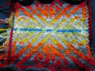
My results were not so good. Effort the first:

My idea here was to have the colors flow from darker to a white hot center. It didn't translate. The biggest problem is the yellow and grey are too similar and they don't track. The eye can't follow the Celtic design when the colors are too close together. The blue in the middle was a mistake too. I was imagining the hot blue center of a flame, but instead I bisected the design. All in all I felt like I was trying to accomplish far too much on too small a canvas.
I did knit the whole thing because I also used this piece for steek practice. Following Eunny's steek tutorials I tried 4 different methods of securing the knitting as follows:
- Do nothing - I found that Palette held together just fine without anything securing it what so ever. This cut sample has traveled to Knitting Guild meetings and kicked around my knitting room and there's been nary a problem.
- Sew with backstitch - The backstitching reduced the natural flexibility of the knitting. This may be a desirable trait in some instances. On a neck line for example.
- Crochet a seam - This gave more flexibility than the backstitch did. It might be useful for a placket neckline that didn't require an other finishing besides tacking down the cut ends.
- Pick up and knit - I like this one! Useful for sleeves, neck bands, or button bands. Very straightforward.
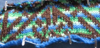
Effort the second:
 Here I was trying to fix the mistakes in my first effort. I picked solid brown to try and make the knotwork stand out more. Then I tried alternating closely related colors every row to try and put some life into the flat shades. But the colors are too far apart in shades and my yarn changes are too close together.
This example hasn't been cut so I can easily rip it and try again. But failures are disheartening and there are so many other enticing ideas to try. I may give it a go again someday, but remove the lightest green color and also change colors less frequently.
Did you learn something from your "failure"? If so it really isn't a failure at all. Colour choices and understanding how they interact really can only be understood if you actually try the various combinations and see the results.
ReplyDeleteStill in Calgary...
I wouldn't call either of these failures - they both look beautiful to me, but I have a somewhat untrained eye, so, what do I know? Practice and experimentation is never failure -- to paraphrase Thomas Edison, you just discovered two ways NOT to combine colors in fair isle.
ReplyDeleteThank you both, of course you're right! I learned tons making both of these. But you must admit, "FairIsle Failures" is an alliterative and catchy title.
ReplyDelete